Wednesday, May 26, 2010

Separating Content and Presentation with the ContentControl

The ContentControl is often overlooked when building Silverlight apps. It’s used inside many controls such as the Button or ChildWindow, but it also turns out to be quite useful on it’s own for separating content from presentation.

Here is a sample of the technique I will be describing. The buttons swap between two completely different “themes” for the same UserControl but the XAML for the UserControl doesn’t contain any theme elements at all, just layout and content. It’s not Picasso, but it will do to illustrate the concept:


You can grab the source files and read my full article on Silverlight Show here.

Monday, May 24, 2010

Backlighting a ListBox

This little Silverlight sample is purely to satisfy my curiosity. I was styling a list box the other day and wondered if it would be possible to simulate backlighting on a selected list box item. The kind of thing you see on a game-show scoreboard where the current dollar value is lit up and casts reflected light over its surroundings. The bit I wondered about was getting a list box item to escape it's boundaries to light up the area around it.

It's completely unrelated to anything I am currently working on (or ever likely to for that matter), but it was something I wanted to do and that is as good a reason for doing it as any!

Here is the finished result and I'll explain how it's done below (try it full screen with the button in the top right corner):


You can grab the source here.

The challenging bit was getting the selected item in the list box to cast a glow on the things around it. The glow seems to escape the list box itself. The reason this wasn't straight forward is that the ListBox control clips its content to keep everything inside the scrollable area. My first instinct was just to set negative margins on something inside the ListBoxItem's template (ItemContainerStyle), but that's when it became obvious that it was being clipped.

So how did I do it? By diving into the ListBox's control template, and then into the ScrollViewer control's template (inside the ListBox control's template) and setting negative margins on the ScrollContentPresenter there. This effectively increases the area the ListBox requires. I then adjusted the ListBoxItem's control template, by setting the margins of the parent Grid to adjust to the extra room in the margin. Here's the steps.

Step 1
I'm assuming you have created a list box. Select it, right click it and select "Edit Template" and "Edit a Copy...". Expand the object tree and find the ScrollViewer element. Right click the ScrollViewer and use the same menu items to edit a copy of the ScrollViewer's control template.

Locate the ScrollContentPresenter element in the object tree view and select it. We need to change its margins, but first use the Advanced Property Options menu (the little yellow box next to the margin boxes) to "Reset" the existing margins, which are bound to the parent style. Once they are reset, change them to -ve values. In my example, I have set all the margins -10.

Step 2
Use the breadcrumb toolbar to exit editing the templates, back out to the main page again. Right click the ListBox and select "Edit Additional Templates" and "Edit Generated Item Container (ItemContainerStyle)" and "Edit a Copy...". This is the control template for the container that will hold each list box item.

At this point you create whatever elements you want in order to create the look you are after. You will have to work out which parts of the template you don't want encroaching into the extra space created by the -ve margins, and increase their margins by the appropriate amount.

In the example above, I have set the top margin of the top level Grid to -10, and the bottom margin set to 10. This counters the -ve top and bottom margins we set on the ScrollContentPresenter and makes the list box items drop back down into the list box area.

Then I've created a child Grid that contains all the elements that are visible when the list box item is not selected. I've set the left and right margins to 10 for those items so they don't poke out the side of the list box.

I've also created a child Grid for the elements that are only visible in the Selected state. That grid has -ve top and bottom margins to counter the values I set on the parent Grid. The items in this child grid will use up the extra 10px all around the list box item. The image to the left show the boundaries of this child grid (the items themselves are hidden).

Step 3
You may have noticed that the list box item elements that extend out of the ListBox now appear over the top of the ListBox border. To fix this, go back into the ListBox control template and drag the ScrollViewer control above it's parent Border. This should make them siblings, with the border just below the ScrollViewer (items lower in the object tree are rendered above items higher up in the object tree). Now the border should render over the top of the list box items.

Other Points of Interest
  • When you are adding elements that use the extra space from the -ve margins, it will look like every list box item is overlapping, but you should only be allowing the overlap for the items that will show in the Selected state so only one will end up showing at a time (assuming you leave the SelectionMode at "Single"). It may help to select the Selected state and turn off recording by clicking the red light in the top left corner of the design area. Don't forget to turn it back on when you are ready to record again.
  • The style is really only for a list box that can show all it's items without scrolling. I completely turned off the scroll bars for the list box since it would just get in the way. I wanted to achieve something very specific and was not interested in creating a style that I could reuse over and over again for any number of items (of any size) in the list.
  • I used a PNG image for the opacity mask for the glow that escapes the ListBox. The linear and radial gradients couldn't give the right shape I was after for the feathered edges.
  • The rest of the visual content is just bling really, and is only there to make the whole thing make sense. Without it I think the example would be a lot less interesting.
So grab the source and have a play. Leave a comment if you like it!

Monday, May 10, 2010

A Chrome and Glass Theme - Part 6

This is the 6th in a series on creating a "Chrome and Glass" Silverlight theme in Expression Blend. The purpose of the theme is to look at all the common controls and point out any interesting or difficult aspects of styling their templates. If you haven't styled many controls before then I recommend you begin with the first post in the series.

This post is about the TabControl. The TabControl is a control I have not been looking forward to writing about. Not because it's boring, but because it is tedious to style unless you only ever want your tabs on one side. The TabControl's control template is really 4 different templates rolled into one; one template for each edge of the TabControl. You use the TabControl.TabStripPlacement property to position the tabs on any of the four sides. Actually it's five control templates if you include the control template for the TabItem (which you should).

Here is a the Chrome and Glass styling of the control:


You can grab the source here. I used a slightly different approach to styling this control - I saved the custom control templates "TabControlChromeStyle" and "TabItemChromeStyle" in the same page as the tab control itself (MainPage.xaml) and then cut and paste it into the ChromeGlass.xaml resource dictionary when I was finished. This makes things just a little bit easier for styling since you are editing the style in-place and it retains the context of the controls you have placed inside it. I would recommend this approach for the TabControl, otherwise you will be styling blind and unable to see the effect of most of the changes you make.

I've only styled two of the four placement options: the top or the bottom. This isn't laziness - it's a valid design decision (truly!). I just don't think tabs sticking out of the side works for the glass and chrome look. When the tabs are on the side they take up far too much horizontal space, and they just don't fit the concept of the theme.

Left-overs from ItemsControl
The TabControl inherits from ItemsControl, which means that it has the "Generated Items (ItemTemplate)" data template, and the "Layout of Items (ItemsPanel)" control template. Neither of these are actually used! You can create custom templates for them if you like, but they are completely ignored by the TabControl. The TabControl handles the collection of items itself and shows only one at a time, using the relevant control template part. The ItemsSource property is another property that you will probably not use unless you are going to manage a collection of TabItems yourself.

The TabControl Control Template
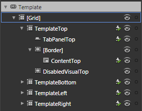
This is the control template for the TabControl. There is a grid for each configuration of the TabControl. The "TemplateTop" grid is made visible when the TabStripPlacement is set to "Top". You can probably figure out the other three...

All four templates follow the same theme: position a TabPanel (just a strip of tabs) and a ContentPresenter. The actual content of the tab pages is kept in the inherited Items property, managed by the TabControl. As a tab from the TabPanel is clicked, the TabControl loads the associated item into the ContentPresenter of whatever grid is being used based on the TabStripPlacement property. Unlike the ListBox, which also inherits from the ItemsControl, the TabControl isn't designed to use a single DataTemplate to show each item it manages. It is designed to have it's tabs and individual item templates created at design time.

I've changed the control template for the TabControl around a little bit (for both the "TemplateTop" and "TemplateBottom" parts). I had to do this because I wanted the selected tab to look like it was the same "piece" as the content area. The default template had the border around the content so there was a line separating the tab from the content. Taking the "TemplateTop" as an example, I've grouped the "TabPanelTop" element into a grid with three columns. The TabPanelTop is in the middle column, and the two side columns have Border controls configured to show lines joining the bottom of the outside tabs to the border around the page content.

The TabItem Control Template
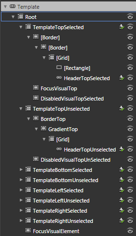
The TabItem template (shown on the right) is the more complex one, and the more tedious one. It contains the template that determines how the actual tab looks (the bit that sticks out). It contains two templates for each position the tabs can be located: one for when the tab is selected, and one for when the tab is unselected. That's a total of 8 templates to style! (unless of course you make the brilliant design decision that you only want one or two positions to be used in your style).

The changes I've made to the TabItem template are to reduce the number of Border controls and to get rid of the gradients and solid fills for the remaining elements. The only background fill is used for the unselected tabs.

The other changes I made were to the states; instead of graying out the whole control I've made them partially transparent. This follows the pattern I've been using for similar controls already completed in the theme.

The TabItem Control Template
One last thing about the TabControl is that it is a pain to style in Blend because the compiled code for the control interferes with normal Blend behavior. For example, if you are editing the TabItem template and use the eye icon in the Object tree to hide or show an element, Blend doesn't always restore the view of the item. The same can happen if you change Visibility between Visible and Collapsed. To make things appear properly again you have to exit out of editing the template, then go back in.

So grab the solution and have a play! Leave a comment if you like it (or if you hate it - or anything in between).

Thursday, May 6, 2010

Quick and Easy Scalable Rounded Bevels

Too Much Photoshop
I was watching a UI design video yesterday where the presenter imported a Photoshop design into Blend and turned it into a Silverlight GUI. One thing I noticed was that he kept a lot of the raster layers from the Photoshop image as graphical elements inside the Silverlight app. If you have a carefully crafted design that uses filters and effects that aren't available in Blend then you have no choice if you want to retain the fidelity of the design mock-up. That usually means, though, that the Silverlight app is going to be at a fixed width/height to match the Photoshop design - since raster graphics don't usually scale well.

I don't like fixed width and height Silverlight apps. I kept thinking "there must be a way to do that in nothing but XAML". Some of the graphics were understandably left as raster since there would be no equivalent way to achieve the same result in Blend. But the elements that bothered me were usually simple panels or buttons that had a common visual theme - they had rounded corners, and they had some kind of bevel that made them appear raised or lowered. This is the sort of thing I mean:


Let's pretend it was a proof done in Photoshop (it was actually an old copy of Paint Shop Pro) and we brought it into Blend. The gradients are easy enough to do in Blend, but what about the shading around the edges of the buttons and panel, giving them a raised appearance?

A lot of the button styles that I've seen people blog about tend to follow 2 or 3 themes: glassy styles with inner glows and highlights; ellipses with radial gradients; or linear gradients. These buttons are either all elliptical buttons, or they don't bother trying to give rounded shading at the edges like the image above.

The problem is the corners. If it weren't for the rounded corners on those rectangles, you could just use thin rectangles hard up against each edge with an appropriate linear gradient. But even then you run into difficulty at the corners where those rectangles meet. There's no easy way to make the gradients from each edge's rectangle meet smoothly.

You could probably do it on a fixed size button with paths shaped specifically for the corners and edges, but then it wouldn't scale well.

This got me thinking about how to achieve the kind of look in the top image, in a way that scales to any kind of size, or roundedness. While the method described below doesn't have the flexibility of the filters and effects that you find in Photoshop, it is a fairly good approximation, and is easy to achieve.

Fuzzy Borders
The approach I came up with is to use Border controls with two sides missing, and the Blur effect applied to make it fuzzy. Here is a working example:


The idea is to use a Border control with a White BorderBrush, the top and left edge thickness set to 3, and the bottom and right edge thicknesses set to 0. Then add another Border control, but with a Black BorderBrush, and the opposite edges showing. The blur effect is set at 4 and the borders are offset by 1 (using the Margin) from the edges. The Opacity of the borders is down at about 30%. That's it - just two borders on top of whatever background you want. And it scales to any size.

The example above uses the same technique for the buttons and for the panel containing the bigger buttons. The only difference in the object tree for the buttons is that there are a couple of extra rectangles to manage States (eg MouseOver, Disabled etc). The buttons swap the colors from black to white and vice-versa for the MouseDown state, and offsets the ContentPresenter element too.

Here are the object trees for the panel and for the button:


You can see that I have copied the elements from the button template into the grid on the right to be used as a panel (should have renamed the element "PanelBorder" instead of "ButtonBorder").

You could also use this as a Control Template for a ContentControl and have a nice reusable 3D panel style.

Here are the files in case you want to play with it.

Saturday, May 1, 2010

A Chrome and Glass Theme - Part 5

This is the fifth in an on-going series on creating a theme that you can use in Silverlight 3 or 4 (eventually).

If you haven't been following along and want to learn the techniques then it is best to start at the beginning with Part 1 here.

By now you should be pretty comfortable with editing control templates so I won't give step by step instructions except for techniques I haven't covered, or for tricky template parts.

In this post we are going to have a look at the ProgressBar and Slider controls. This is what the final result will look like:

You can grab the files here.

The ProgressBar Control
The control template for the ProgressBar control looks like this:
The red circle is around the Control Part icon. That icon indicates that the control expects there to be an element in the template called "ProgressBarTrack", and it usually has to be a control of the same type as is used in the default control template - in this case a Border control for "ProgressBarTrack" and a Rectangle element for "ProgressBarIndicator".

A Control Part is critical to a control - the compiled code that manipulates the visual elements expects to find those named parts and won't work without them. Fortunately their names indicate what they do. "ProgressBarTrack" is obviously the track that the progress runs along and "ProgressBarIndicator" is the part that grows to show progress.

For the ProgressBar control, this means that we are restricted to a single Rectangle element to show the progress.

Styling the progress bar is not hard. The points that are possibly worth mentioning are:
  • The "ProgressBarTrack" has it's Border and Background brushes bound to the same named properties on the control (template bindings), so change these values on the style, not the "ProgressBarTrack" element. The same goes for the "ProgressBarIndicator" - its Fill brush is bound to the Foreground property on the parent control.

  • The "IndeterminateRoot" contains elements that are shown when the "IsIndeterminate" is set to true. The storyboard for the IndeterminateState has an animation that is set to loop Forever. I'll cover this more below.

  • The ProgessBar control doesn't have a Disabled state since it doesn't receive focus and is not intended to be interacted with
If you select the "Indeterminate" state you can click on the storyboard name just under the "Objects and Timeline" tab, and see its properties in the Properties panel. The RepeatBehavior for this storyboard is set to "Forever". The idea here is that when you wish to show that progress is being made but you have no way of calculating the progress (such as carrying out a time-consuming task on the server), you can set the progress bar's IsIndeterminate property to true and it will continually animate until you set it to false. For that reason, if you change the appearance of the Indeterminate state for the ProgressBar, it is advisable to keep some kind of continual animation happening.

Of course, there is no reason why you are limited to an angled gradient moving across the bar - you could instead show pixies dancing from side to side, or a conveyor belt dropping toys in a box. Go wild! The only restrictions are that the Control Parts must be kept and used to show the progress when it is not Indeterminate.

The Slider Control
The Slider control is fairly straight forward - the control template is shown on the right. Like the Scrollbar control, there is a vertical and a horizontal template. I have created a separate resource for a Thumb control and assigned it to both the HorizontalThumb and the VerticalThumb. To do this, you would carry out the following steps:
  1. Select the HorizontalThumb element

  2. Create a copy of its control template, saving it (for now) as "HorizontalThumbGlassStyle"

  3. Make your changes to the thumb template

  4. Exit the Thumb control template, back to the Slider control template

  5. Use the Advanced Property Options button next to the "Style" property for the "HorizontalThumb" element (in the "Miscellaneous" group) to "Convert to new resource...", and saving it as "ThumbGlassStyle"
You can then delete the "HorizontalThumbGlassStyle" from the Resources tab, and assign the "ThumbGlassStyle" to the VerticalThumb's Style property.

There's one more thing to be aware of. The Thumb style resource I created for the slider has a 1 pixel gap between the border of the "Background" element and the "BackgroundGradient" element. I noticed that moving the mouse over the thumb caused the MouseOver state to quickly show, then hide, and then show again. This was because of the gap between the border and the fill - the "Background" Border element has a null brush for it's Background property. Since there was no element of the Thumb under the mouse when it was over the gap, Silverlight considered that the mouse had left the element and put the Thumb into the Normal state. To fix this, I set a solid background color for the top level grid, and set the Alpha for the color to 0. Doing this ensured that there is a solid control under the mouse in the gap, even if it is fully opaque.